
Building a Visually Persuasive Store: The Role of Color Psychology and Imagery in CRO
Long before a visitor reads a single word, they form an impression based on your store's visual design. Color and imagery are not just decorative; they are powerful tools that evoke emotion, build trust, and guide user behavior. We'll explore how to use them strategically to boost conversions.
Design for Conversion

Visual Persuasion Checklist
Implement these visual design tactics to create a more trustworthy, emotionally engaging, and conversion-focused user experience.

Use a Contrasting CTA Color
Ensure your primary call-to-action button color stands out from the rest of your page's color palette.
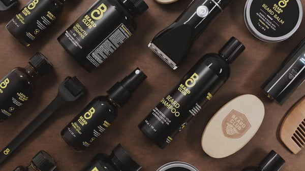
Invest in High-Quality Imagery
Use professional, high-resolution product photos and lifestyle shots. Avoid generic stock images.
Show Products in Context
Include images or videos of your products being used by people to help customers visualize the benefits.
Ensure Typographic Hierarchy
Use clear differences in font size and weight to distinguish between headlines, sub-headlines, and body text.
Leverage White Space
Surround important elements, like your CTA, with enough negative space to make them the clear focal point.
Use Directional Cues
Subtly guide user attention with visual cues, such as images of people looking towards your CTA or headline.
The Role of Color Psychology and Contrast
Color is the first and most immediate visual cue your brain processes. It evokes emotion, conveys meaning, and directs attention. In ecommerce, a strategic color palette builds brand identity and creates a clear visual hierarchy, guiding users toward key actions. The goal is not to find a single 'magic' color, but to use color consistently and intentionally.
- Brand Association: Colors evoke distinct feelings. Blues often signal trust and security (common in finance), while greens suggest health and nature. Your brand's primary colors should align with the emotions you want to convey.
- The Isolation Effect: To make your primary Call-to-Action (CTA) stand out, use a color that contrasts sharply with the rest of your page. This visual isolation makes the desired action path immediately obvious.
- Cultural Context: Be aware that colors can have different meanings across cultures. What works in one region might not resonate in another, a key consideration for international ecommerce.
The Power of High-Quality, Contextual Imagery
Your product imagery is your most powerful selling tool. In the absence of a physical product, high-quality photos and videos must do the heavy lifting of communicating value, quality, and detail. Generic stock photos or low-resolution images can instantly destroy trust and make your brand feel unprofessional.
Key Imagery Strategies:
- Multiple High-Resolution Photos: Show your product from every angle. Include zoom functionality so users can inspect details.
- Lifestyle & Contextual Shots: Go beyond a simple product-on-white-background. Show the product in use, in a real-world setting. This helps customers visualize themselves benefiting from the product.
- Human Faces: Including images of people (especially smiling faces looking towards the CTA) can create an emotional connection and direct user attention.
Using Visual Cues to Direct Attention
You can subtly guide a user's eye through a page using visual cues. These are directional elements that subconsciously tell the user where to look next. When used effectively, they create a seamless and intuitive flow, leading the user naturally towards the conversion goal.
- Explicit Cues: These are the most obvious cues, such as arrows or pointing fingers that direct the eye towards a CTA or form.
- Implicit Cues: These are more subtle. For example, using a photo of a person whose gaze is directed at your headline or CTA will naturally cause the visitor to look there as well.
- White Space: The absence of content is a powerful directional tool. Surrounding your primary CTA with ample white space makes it the focal point of the page.
The Persuasive Power of Typography
Typography is the art of arranging type to make written language legible, readable, and appealing. Your choice of fonts says a lot about your brand and significantly impacts the user experience. Good typography builds trust and makes your content effortless to consume.
- Brand Personality: A traditional serif font (like Times New Roman) conveys authority and reliability, while a modern sans-serif font (like Helvetica) feels clean and minimalist. Your font choice should match your brand's personality.
- Readability is Key: Ensure your body text is a sufficient size (at least 16px is recommended) and has a high contrast with the background.
- Hierarchy Through Typography: Use different font sizes, weights (bold, regular), and styles to create a clear hierarchy between headlines, sub-headlines, and body copy. This makes your content scannable and easier to digest.

Power Commerce handles every step—from data export to store design, payment setup, and optimisation, so you can focus on growing your business.
Get in TouchStay aligned on what's happening in the commerce world
Other CRO Tips
Explore Further Optimization Ideas
The Future of CRO: How AI and Machine Learning Are Changing Website Optimization
Explore Further Optimization Ideas
Optimizing for Accessibility: How an Inclusive Website Improves UX and Conversions for Everyone
Explore Further Optimization Ideas
Augmented Reality (AR) in Ecommerce: A New Tool for Boosting Conversion and Reducing Returns
Explore Further Optimization Ideas
How to Use Customer Journey Mapping to Identify Your Biggest CRO Opportunities

Trusted by 1000+ innovative companies worldwide
Schedule Your Migration Today
For businesses prioritizing simplicity, scalability, and robust support, Shopify is the clear winner.
Looking to migrate without hassle? Power Commerce can handle the entire process, ensuring smooth data transfer, store setup, and post-launch success.
Marka Marulića 2, Sarajevo, 71000 BiH
00387 60 345 5801
[email protected]