
UX & UI Enhancements: The Foundation of Ecommerce Success
Great design is more than just aesthetics; it's about creating an experience that feels intuitive, trustworthy, and effortless. Understanding the interplay between User Experience (UX) and User Interface (UI) is the key to building a site that not only looks good but converts effectively.
Enhance Your Experience

High-Impact UX/UI Enhancements to Test
Small changes to your UX and UI can have an outsized impact on conversions. Here are some of the most effective enhancements to consider.

Improve Readability
Use large, legible fonts (at least 16px for body text) and high contrast between text and background to reduce eye strain.
Simplify Navigation Menus
Limit the number of top-level menu items to the essentials. Use clear, simple labels that users will instantly understand.
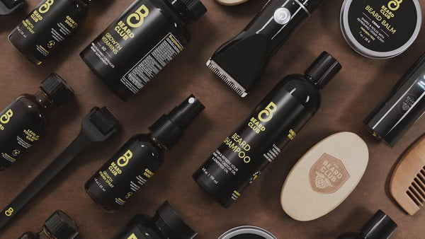
Use High-Quality Visuals
Invest in professional product photography and videography. High-quality visuals build trust and better communicate product value.
Design Obvious CTAs
Your main call-to-action buttons should stand out with a contrasting color and have clear, action-oriented text.
Ensure Mobile-First Usability
Prioritize your mobile design with large touch targets and a thumb-friendly layout. Test it on real devices.
Provide Visual Feedback
When a user clicks a button, it should visually change (e.g., a color shift or loading spinner) to confirm the action was received.
Defining User Experience (UX): The Overall Feeling
User Experience is the overall perception a customer has of your brand as they interact with your site. It's not about a single page, but the entire journey—from how they discover your products to how easy it is to complete a purchase. Good UX is strategic and focuses on making this journey logical, intuitive, and frictionless.
Core UX Goals:
- Information Architecture: Organizing your content and products in a logical, predictable way so users can easily find what they need.
- User Flow Optimization: Creating a clear, simple path for users to follow to complete a specific goal, such as making a purchase or signing up for a newsletter.
- Usability: Ensuring the website is easy to use, efficient, and free from frustrating errors or dead ends.
Defining User Interface (UI): The Visual Elements
If UX is the strategic blueprint, User Interface is the tangible execution of that plan. UI design focuses on the visual and interactive elements that users see and touch. It's about translating the brand's identity into a functional interface that is both beautiful and easy to use.
Key UI Components:
- Visual Hierarchy: Using size, color, and placement to guide the user's eye to the most important elements on the page, like the 'Add to Cart' button.
- Brand Consistency: Applying a consistent visual language—including typography, color palettes, and button styles—across the entire site to build familiarity and trust.
- Interactive Feedback: Providing clear visual feedback for user actions, such as a button changing color when hovered over or a subtle animation when an item is added to the cart.
The Principle of Clarity & Simplicity
The best interfaces are those that users don't even have to think about. The goal is to remove all ambiguity and unnecessary complexity. Every element on the page should have a clear purpose, and the language used should be simple, direct, and free of jargon. This 'less is more' approach reduces cognitive load and allows users to focus on their primary goal: finding and purchasing a product.
Achieving Clarity:
- Familiar Patterns: Use common design patterns that users already understand, such as a shopping cart icon in the top-right corner.
- Concise Copy: Write clear, scannable headlines and button text.
- Visual Decluttering: Use ample white space to give page elements room to breathe and guide the user's focus.
The Principle of Consistency & Predictability
A consistent design creates a predictable and reliable experience. When users know what to expect, they feel more confident and in control. This means a button that adds an item to the cart on one page should look and behave the same way on another. This principle applies to all aspects of the design, from the layout of product pages to the style of your form fields.
Areas for Consistency:
- Navigation: Your main navigation menu should remain in the same place and function the same way on every page.
- Interactive Elements: All buttons, links, and forms should have a consistent visual style and behavior.
- Terminology: Use the same terms for the same actions across the site (e.g., always use 'Cart' instead of switching between 'Cart' and 'Basket').

Power Commerce handles every step—from data export to store design, payment setup, and optimisation, so you can focus on growing your business.
Get in TouchStay aligned on what's happening in the commerce world
Other CRO Tips
Explore Further Optimization Ideas
The Future of CRO: How AI and Machine Learning Are Changing Website Optimization
Explore Further Optimization Ideas
Optimizing for Accessibility: How an Inclusive Website Improves UX and Conversions for Everyone
Explore Further Optimization Ideas
Augmented Reality (AR) in Ecommerce: A New Tool for Boosting Conversion and Reducing Returns
Explore Further Optimization Ideas
How to Use Customer Journey Mapping to Identify Your Biggest CRO Opportunities

Trusted by 1000+ innovative companies worldwide
Schedule Your Migration Today
For businesses prioritizing simplicity, scalability, and robust support, Shopify is the clear winner.
Looking to migrate without hassle? Power Commerce can handle the entire process, ensuring smooth data transfer, store setup, and post-launch success.
Marka Marulića 2, Sarajevo, 71000 BiH
00387 60 345 5801
[email protected]